Web Design for Consultants: Building a Website That Actually Wins Clients (Not Just Looks Pretty)
Here's the thing I see all the time with consultants: you're brilliant at what you do. You've got the expertise, the track record, the client results. But your website? It's either doing absolutely nothing for your business, or worse—it's actively turning potential clients away.
I get it. You didn't become a consultant to become a web designer. You built your practice on your expertise, your methodology, your ability to solve complex problems. But in 2026, your consulting website is often the first (and sometimes only) impression you make on a potential six-figure client. And if it doesn't immediately communicate credibility, clarity, and capability? They're gone.
Website design for consultants is different from, say, building a site for a product-based business or even a creative agency. Your ideal clients aren't browsing—they're researching. They're evaluating. They're trying to figure out if you're the right strategic partner for their organization. That requires a completely different approach to how we structure, design, and message your online presence.
So let me walk you through what actually makes consultant website design work, using real examples from consulting firms I've worked with across different industries and specialties.
Why Web Design for Consultants Requires a Different Strategy
Most consultants I talk to fall into one of two camps. Either they've got a DIY site they threw together years ago that's basically a digital business card, or they hired someone who made it look nice but didn't understand the consulting sales cycle at all.
The problem? Neither approach addresses what your potential clients are actually looking for when they land on your site.
When someone visits a consultant's website, they're not casually browsing. They've got a problem—usually an expensive, complex, high-stakes problem—and they're trying to determine if you're capable of solving it. They want to know your methodology, see your credentials, understand your process, and get a sense of whether you're the right fit for their organization.
That means your website needs to do way more than look professional. It needs to build trust immediately, demonstrate expertise clearly, and guide visitors toward a conversation. Your consulting website is a conversion tool disguised as a brand presence.
What Actually Works in Website Design for Consultants
Let me show you what this looks like in practice across different consulting niches. Because here's what I've learned from designing websites for everyone from DEI consultants to corporate advisors to executive coaches: the fundamentals of good consultant web design stay consistent, even when the aesthetics change dramatically.
OQ Strategies: Down-to-Earth Expertise in DEI Consulting
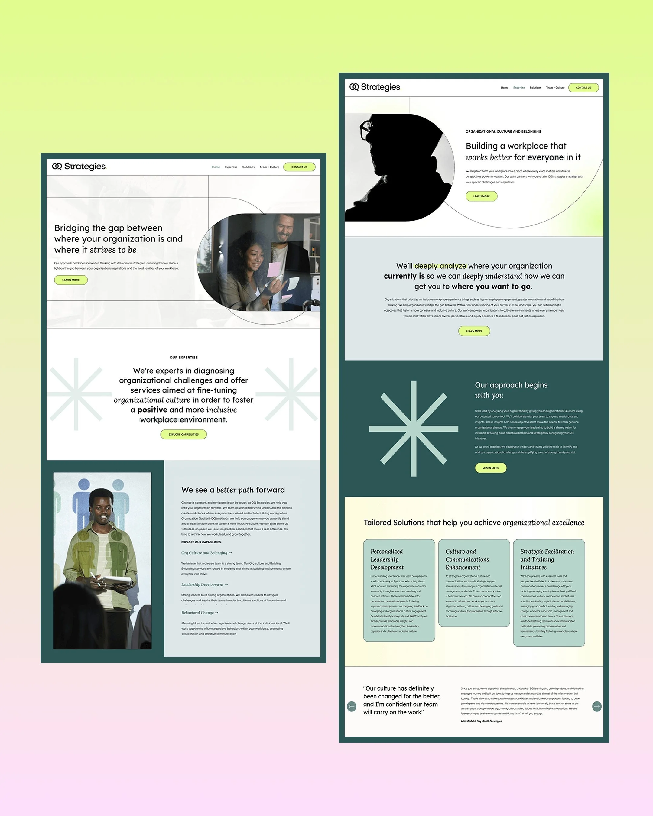


OQ Strategies specializes in organizational effectiveness, diversity equity and inclusion, and culture transformation. These are sensitive, nuanced topics that require both expertise and approachability—a tricky balance to strike in website design for consultants.
The challenge here was creating a consultant website that felt professional and trustworthy without being corporate in a way that would create distance. DEI work requires vulnerability and connection, which means the brand needed to be down-to-earth while still demonstrating serious business acreditation.
We went with a clean, modern design that uses bold typography and strategic color—including this vibrant neon accent that adds energy without feeling frivolous. The site clearly communicates their methodology (organizational effectiveness isn't vague feel-good work, it's measurable change), showcases their team's credentials, and makes it easy for potential clients to understand their process.
The key with consulting website design for this type of work? Don't hide your expertise behind corporate speak. OQ's site is direct about what they do, who they serve, and the transformation they create. No fluff, just substance presented in an accessible way.
The Future Quo: Bold Branding for Social Innovation Consulting


Then there's The Future Quo—a New York City-based corporate consultancy that works with social innovation leaders to design a future that works better for more people. Talk about a big vision requiring big presence.
This was a solopreneur consultant who needed her personal brand to feel equal parts "her" and equal parts "trustworthy consultancy." That's a tension I see constantly in web design for independent consultants. You need the credibility of an established firm without losing the personal connection that makes working with you different.
We went bold. Really bold. The website uses energetic colors, confident typography, and a visual identity that says "this is someone who thinks differently about the future." The brand vibe is purposeful, equipped, innovative, and empowered—all things her ideal clients (forward-thinking executives and organizations) want to feel.
Here's what the founder Tameka said about the process: "This was my first time launching a brand and as it is a solopreneur venture, the brand had to be equal parts 'me' and equal parts a trustworthy company. Angelique's methodology allowed me to navigate this seamlessly."
That's the thing about website design for consultants who are building their own firms—you can't just copy what big consultancies are doing. Your site needs to reflect your unique perspective and personality while still communicating that you're a serious strategic partner.
The Talent Collection: Sophisticated Recruitment Consulting in London


The Talent Collection is a UK-based recruitment firm connecting transformation and technology talent with ambitious companies. The founder Dan had 15+ years in the industry and was launching his own firm, which meant the website needed to balance personal relationships with professional credibility.
We created this sophisticated, masculine, high-end brand identity that communicates trust and professionalism immediately. The color palette is refined, the typography is confident without being aggressive, and the overall aesthetic says "we operate at the highest level."
But here's what made this consultant website actually work: we didn't just make it pretty. Every element of the site reinforces that recruitment is about connecting the right people at the right time. The messaging focuses on personal relationships, strong communication, and proven expertise—the things that actually differentiate a great recruitment consultant from a mediocre one.
This is a perfect example of web design for consultants in competitive industries. You're not selling something radically new or different—recruitment consulting exists everywhere. So your website needs to communicate why YOU specifically, why YOUR approach, why YOUR relationships matter.
Key on Harmony: Executive Coaching Meets Modern Design
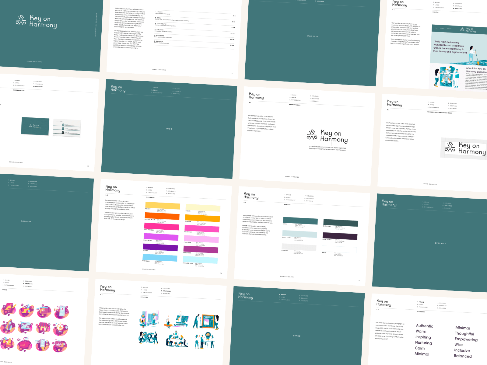
Key on Harmony helps high-performing individuals and executives unlock extraordinary results in their teams and organizations. This required balancing lifestyle and business positioning—executive coaching that feels both nurturing and results-driven.
We went with sophisticated yet vibrant design, using illustrations, strategic color choices, and modern typography that feels like new-age tech meets executive presence. The brand vibe is professional without being stuffy, warm without being soft.
What makes this consulting website work is how it positions the service. Executive coaching can sometimes feel fluffy or unclear in terms of ROI. This site makes it crystal clear: this is about unlocking performance, driving results, and achieving extraordinary outcomes. The design supports that positioning with a polished, contemporary aesthetic that appeals to successful executives who want to level up.
Website design for consultants in the coaching space requires walking this line constantly. You need warmth and connection (because coaching is relational) alongside credibility and results (because executives need to justify the investment).
Jeanne Louise: Clean Sophistication for Digital Marketing Consulting


Jeanne Louise is a digital marketing strategist and podcaster helping clients create impact and attract clients. Her brand identity needed to be warm, neutral, clean, and sophisticated—reflecting her strategic approach to marketing without feeling cold or corporate.
We created a brand that's understated but memorable. The logo design is elegant and minimal, the color palette is warm neutrals that feel expensive, and the overall aesthetic communicates "I know what I'm doing and I'm not going to overcomplicate it."
This is a great example of how consultant web design doesn't always need to be bold or loud. Sometimes the most sophisticated approach is restraint. When your consulting services are about cutting through noise and creating clarity (like digital marketing strategy), your website should demonstrate that same philosophy through clean, focused design.
Thrive Positivity: Proving Consulting Websites Can Be Playful


And then there's Thrive Positivity, which proves that not all consulting website design needs to be serious and corporate. This Bristol-based consultancy offers corporate wellbeing workshops and coaching, helping teams practice positive wellbeing in a way that's actually fun.
We went full playful—vibrant colors (bright greens and yellows), quirky illustrations, bold shapes, and an energy that's impossible to ignore. The brand vibe is intentionally memorable, fun, and bold, because that's exactly what differentiates their approach to corporate mental health support.
Here's the lesson: your web design for consultants should match your methodology. If your competitive advantage is that you make something traditionally boring or heavy into something engaging and accessible, your website better reflect that immediately. Thrive Positivity's site tells you everything you need to know about their approach before you read a single word.
The Consulting Website Design Elements That Actually Matter
After designing websites for consultants across industries, here's what I've learned actually moves the needle:
Clear positioning from the first scroll. Your homepage needs to immediately answer: What do you do? Who do you serve? What transformation do you create? If a visitor has to hunt for this information, you've already lost them.
Credibility indicators that don't feel like bragging. Your years of experience, client results, methodologies, credentials—these matter immensely to consulting clients. But they need to be presented as proof points, not ego boosters. Show the work, not just the accolades.
A process or methodology section. Potential clients want to understand how you work. Even if you customize every engagement, having a clear framework or methodology demonstrates that you're not just winging it. This is especially critical in web design for business consultants where clients are making significant investments.
Case studies or client work that tell stories. Generic testimonials are nice. Detailed case studies showing the problem, your approach, and the measurable results? That's what actually builds confidence. Your consulting website should showcase your best work in a way that helps prospects see themselves in those stories.
Design that matches your market position. If you're charging premium rates, your website better look premium. If you're the approachable alternative to stuffy big consultancies, that should be obvious visually. Website design for consultants isn't one-size-fits-all—it needs to align with your positioning and pricing.
What Makes Consultant Websites Fail (And How to Avoid It)
The biggest mistakes I see in consultant web design aren't usually about aesthetics. They're about strategy. Or lack thereof.
Mistake number one: treating your website like a brochure instead of a conversion tool. Your site exists to start conversations and move potential clients toward booking a discovery call. If it's just information sitting there looking pretty, it's not doing its job.
Mistake number two: vague positioning and generic messaging. "We help companies transform and achieve results" doesn't differentiate you from anyone. Your consulting website needs to be specific about who you serve, what problems you solve, and why your approach is different.
Mistake number three: design that doesn't match your expertise level or market position. You can't charge $50K+ for consulting engagements with a website that looks like you built it on a free platform in 2015. The design quality signals the quality of your work, whether we like it or not.
Mistake number four: making it hard for people to actually contact you. I see consultant websites all the time where the contact information is buried, there's no clear call-to-action, and potential clients have to work to figure out how to start a conversation. That's leaving money on the table.
Building a Consulting Website That Actually Works for Your Business
Look, I'm not going to tell you that web design for consultants is simple or that you can just DIY it and expect great results. If you could, you probably would have already.
The consultant websites that actually generate leads and win clients are built on strategy first, design second. They're clear about positioning, intentional about user experience, and ruthlessly focused on moving the right people toward a conversation.
Whether you're a DEI consultant like OQ Strategies needing to balance professionalism with approachability, a solopreneur like The Future Quo building a personal brand with corporate credibility, or a recruitment consultant like The Talent Collection competing in a crowded market—your website needs to do the heavy lifting of communicating your value before you ever get on a call.
That means investing in professional website design for consultants who understand your industry, your sales cycle, and your specific positioning challenges. It means being willing to put real strategy and thought into your messaging, not just picking a template and filling in the blanks. And it means recognizing that your website is one of your most important business development tools, not just a checkbox to complete.
The consultants who win in competitive markets aren't necessarily the ones with the most experience or the biggest teams. They're the ones who can communicate their value most effectively—and increasingly, that communication starts with your website.
Ready to build a consultant website that actually wins clients? Book a strategy call to discuss your web design project
Want to see more consulting website design examples? Check out our full portfolio here