Healthcare Logo Design: 7 Inspiring Health and Wellness Logo Ideas for Your Medical Brand
If you've been searching for healthcare logo design ideas, you've probably noticed that A LOT of them look the same. Leaves, soft palettes, clean typography, a general sense of "trusted and approachable." Nothing wrong with any of it, but it’s also not that memorable either.
The logos that actually build recognition for a healthcare practice are built around something more specific than aesthetics. They start with one clear question: who exactly is this patient, what are they feeling when they find this practice, and what does the brand need to communicate before they read a single word?
I've been designing brands for healthcare practitioners for seven years, across fertility, functional medicine, nutrition, therapy, and women's health. Here are seven projects from my portfolio where that question got answered well, and the thinking behind each one.
What a good healthcare logo design idea actually starts with
Every logo brief I work through starts with the same question: who is the specific person this practice most wants to attract, and what are they feeling when they find it? A woman who's been navigating fertility challenges for two years is in a completely different emotional state than someone booking their first aesthetic consultation. The logo, the type, the palette — all of it speaks to that emotional state before the person has read a single word of copy.
That's what health and wellness logo design is actually doing. Not labeling a business. Connecting with a person. And the practices that understand that distinction end up with brands that actually do something.
Explore 7 Healthcare Logo Design & Branding by Angelique Vestil
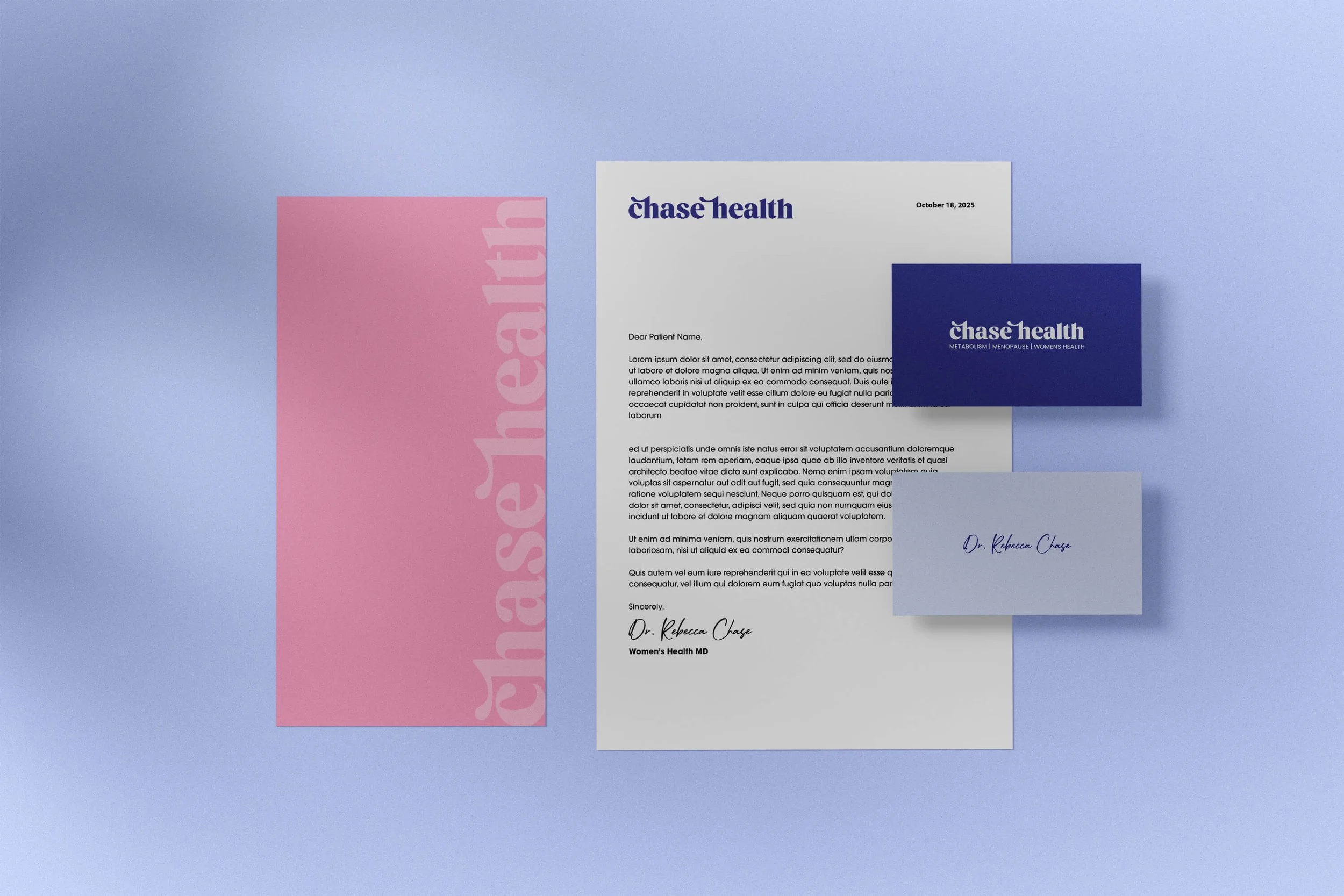
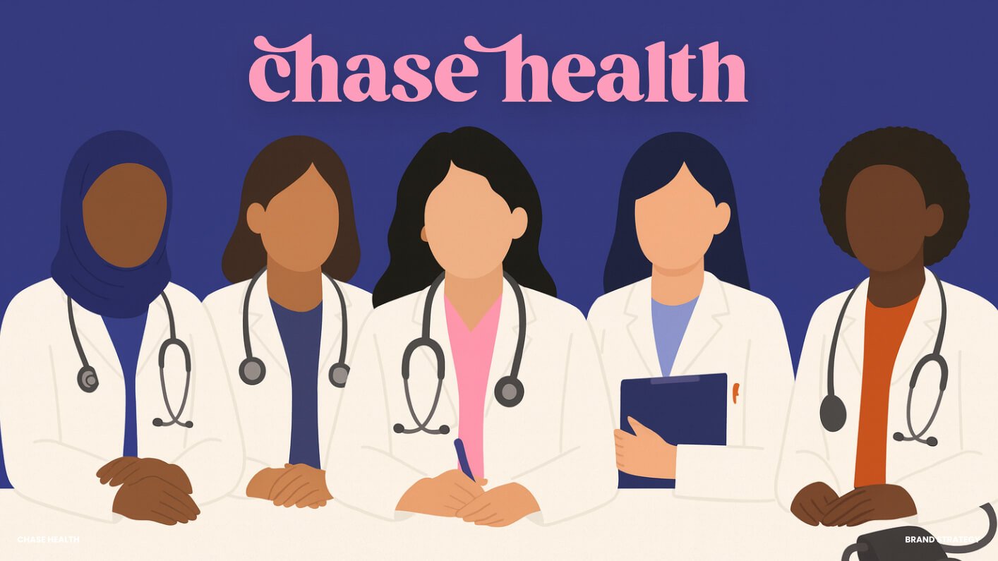
1. Chase Health: Bold Women's Healthcare Telehealth Physician Logo Design
Dr. Rebecca Chase built Chase Health to be the women's health practice that actually resonates with Gen Z — proactive, science-backed care for women in midlife, without the stiff clinical aesthetic that most doctor brands default to.
The goal was to create branding that was designed to break the mold of what traditional private practice logos should look like. Most women's healthcare branding plays it safe: soft colors, serif fonts, a vague sense of calm. Chase Health went bold and feminine with hand-drawn illustration elements woven throughout the identity. The result is a brand that feels like a doctor who speaks to you like a person, explains what's actually happening in your body, and genuinely wants to help — not one that clinically looks like every other practice out there
This is one of my favorite examples to share when practitioners say they want to look "professional." Professional doesn't have to mean safe. For the right practice and the right patient, a bold health logo design is actually the more credible choice.
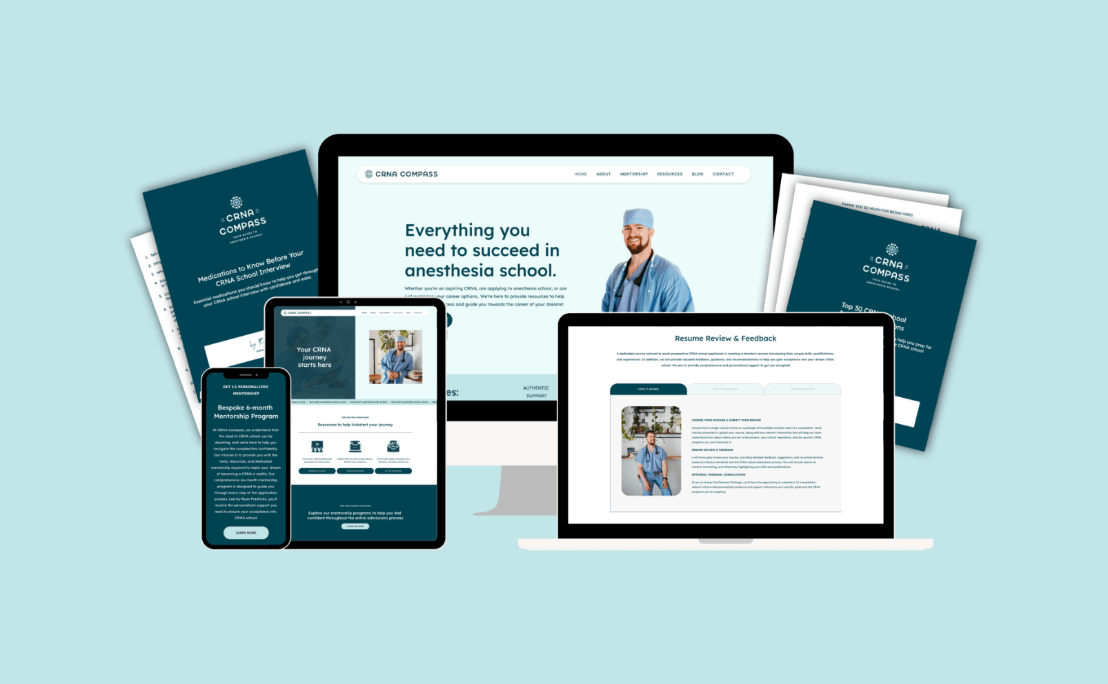
CRNA Mentoring & Career Coaching Logo Design
2. CRNA Compass: CRNA Career Coaching Logo Design
This project for CRNA Compass had a specific challenge: certified registered nurse anesthetists are highly specialized medical professionals, and the brand needed to communicate both clinical expertise and the supportive nature of the mentorship service. That's two different emotional registers in one logo.
The compass concept solved it cleanly. A compass communicates navigation, direction, and expertise without being literal about the anesthesia specialty — and it scales beautifully from a business card to a digital profile. The typography and color choices kept it grounded in a clinical register while the concept itself added the warmth the mentorship angle needed.
If your specialty is niche, this is a useful principle for your own healthcare logo design ideas: look for a metaphor that communicates the experience of working with you, not just the clinical function of what you do.

acupuncture clinic and integrative therapy health and wellness logo design
3. Connected Healing: Acupuncture & Integrative Therapy Logo Design
Connected Healing is an integrative therapy practice specializing in fertility, women's health, Chinese medicine, and whole-body integrative care. The logo mark is one of my favorites in the portfolio and I don't say that lightly.
What reads as a botanical sprig is actually a symbol of sperm and egg, designed to be felt rather than read. You sense the fertility connection without it ever reading as clinical or heavy. The palette of deep forest green, terracotta, warm sage, and cream reinforces groundedness throughout the whole identity.
The brief was to find a place where "ancient wisdom meets modern science," and every design decision built toward one feeling: being held. That's a VERY specific brief. And that specificity is what makes the brand recognizable. When you're searching for health and wellness logo ideas for an integrative or alternative practice, this one is worth studying closely — because the work it's doing is almost invisible on the surface.

Functional Medicine & Digestive Health Coaching Logo Design
4. The Gut Healing Ninja: Nutrition Health Coaching Logo Design
The Gut Healing Ninja leans into personality as a strategy. The character-based branding and energetic color palette take a topic that most patients feel embarrassed to Google and make it feel approachable — even a little fun. That's not an accident. When you're dealing with symptoms that people tend to underplay or feel ashamed of, a brand that reduces the anxiety around discussing them is actually building trust faster than a clinical-looking alternative would.
This is one of the most interesting health and wellness logo ideas I've executed, and it's a good reminder that playful and credible aren't opposites. Sometimes playful is the more effective choice for building patient comfort.

logo design for dietitian and functional nutritionist
5. The Pohlman Institute: Diabetes Dietitian & Nutrition Health Coach Logo Design
The Pohlman Institute is a nutrition and health practice focused on blood sugar balance, root-cause symptom work, and a full-body methodology. The brief was earthy and nurturing — but the visual direction intentionally moved away from the soft, feminine palette that saturates most of the nutrition space.
The practice works with a broad range of clients, and the brand needed to feel grounded and approachable without the daintiness that often becomes shorthand for women's wellness. Warm, earthy tones, clean typography, an overall feeling of trustworthiness. The statement the brand makes is: this practitioner takes your symptoms seriously and has a real approach to addressing them.
If you're designing a healthcare logo for a more evidence-based or clinical nutrition practice, this is a useful counterpoint to the lighter, more aspirational direction most nutrition brands default to. You can be warm and authoritative. It's not either/or.

Fertility health coaching logo design
6. The Functional Fertility Clinic: Fertility Private Practice Logo Design
Fertility branding is emotionally complex in a way most healthcare niches aren't. The patient finding this practice is often carrying both hope and grief simultaneously. A brand that leans too hard into either direction misses them entirely.
The direction for The Functional Fertility Clinic was designed to feel grounded and credible with warmth built in: earthy, intentional, and specific enough to communicate that this practice has a real methodology — not just a comforting presence. The feeling we were going for was: you're going to be okay, and you're going to be taken seriously. Both of those things had to be present at once.
For practitioners working in fertility, mental health, or any area where patients come in already emotionally stretched, your health logo design has a job to do before the copy even loads. This project is a useful reference for what that can look like.

logo design for speech pathologist for children
7. Medley & Mesaric Therapy Associates: Speech Therapist Logo Design
Medley & Mesaric Therapy Associates is a speech therapy private practice supporting children across a wide variety of communication profiles — autism, apraxia, Down syndrome. The logo mark shows a therapist and child working hand in hand, which is literally what the practice does. But the mark alone isn't what makes the brand work.
Because this practice primarily serves children, the design leaned into color and playfulness intentionally. The goal wasn't to look clinical. The goal was for a tired, worried parent to land on the site and immediately feel that their kid is going to like it here — and feel safe. The color palette does that before the copy has a chance to.
This is a good principle for any pediatric or family practice thinking through health and wellness logo ideas: your patient and your client aren't the same person. The parent is making the decision. Design for their emotional state, not just the specialty.
What these healthcare logo design ideas have in common
Seven practices, seven completely different visual identities. No shared palette, no shared mark style, no consistent aesthetic thread. What every one of them has in common is that none were built for a generic idea of healthcare. Each started with one specific patient, one specific emotional state, and a clear answer to what that person needed to feel before they read a single word of copy.
A woman navigating fertility challenges has nothing in common emotionally with someone booking their first aesthetics appointment. The logo that makes one feel found would completely miss the other. That's not a problem to solve. That's the whole premise of branding that actually works.
If you're searching for your own healthcare logo design ideas and keep feeling like nothing's quite right, that's usually what's missing. Not a better reference image. A clearer picture of exactly who you're designing for.
The top wellness and medical spa logo design examples to inspire your practice post goes into a wider range of projects if you want more to look at. And if you want to see how this kind of branding carries through to a full website, the health and wellness website design examples post is worth reading next.
When you're ready to work on yours, get in touch here.
Health and Wellness Logo Ideas by Healthcare Specialty
Different specialties have genuinely different design briefs, and mixing them up is one of the faster ways to end up with a brand that connects with no one.
Women's health branding is one of the more nuanced to get right. The instinct is usually to go soft and feminine, and sometimes that's correct. But the practices that stand out made a more specific choice: bold and empowering for a physician speaking to younger patients, warm and grounded for a fertility practice where the patient is already emotionally stretched. Soft and feminine as a default just blends in.
Functional medicine and integrative practices often need to do two things at once: feel credible to a patient who's been dismissed by conventional medicine, and feel distinct from the sea of earthy wellness brands already out there. The ones that work usually commit to one clear visual direction rather than pulling from the same reference pool as everyone else.
Mental health and therapy branding carries its own requirements. The visual identity is doing emotional work before the patient has read anything. It needs to feel safe, and specific enough that the right person feels found rather than just generically welcomed.
For more specialized practitioners — a CRNA, a functional fertility coach, a diabetes dietitian — the brand usually needs to carry more authority. The patient who finds them has typically done their research already. They're looking for confirmation that they've found someone serious.
Common Healthcare Logo Design Mistakes to Avoid
The most common mistake I see in healthcare logo design is being too literal. A stethoscope doesn't make a medical logo memorable. Neither does a cross, a heartbeat line, or a leaf. Those symbols are already on thousands of logos, and if yours blends into the category, it's not doing much for you.
The other thing that trips practitioners up is designing for print and forgetting about digital. Your logo needs to work as a small circle on Instagram, as a favicon in a browser tab, as a header on a mobile screen. If it reads clearly small, you're fine. If it loses its shape or gets muddy, that's worth solving before you finalize anything.
And the audience piece is worth saying plainly: a pediatric speech therapy practice and a functional medicine clinic for high-performing women are not the same brand. The visual language that makes a worried parent feel safe would completely miss a patient who's looking for clinical credibility. Getting specific about who you're designing for is what keeps you from ending up with something that looks like every other practice in your niche.
The Business Impact of Strategic Healthcare Branding
The most practical thing I can tell you about a strong healthcare logo is that it does a lot of the work before you ever speak to a patient. Someone finds your website, sees a brand that feels right for them, and they're already halfway there. The consultation is easier. The "yes" comes faster. You're not spending the first twenty minutes building basic trust because the visual identity already handled it.
That's the difference between inquiries from people who are pre-sold on working with you and inquiries from people who are still deciding. A well-designed brand strategically filters for the right patient before you ever hop on a call with them or walk through the doors of your practice.
It also creates consistency across every place someone might encounter you — your Google listing, your Instagram, your email signature, your intake forms. When those all feel like the same coherent thing, the practice reads as more established, more considered, and worth what you're charging.
Ready to Build Your Own Healthcare Brand?
The seven projects in this post all started in the same place: a clear answer to who the patient is and what they need to feel. That's the brief worth getting right before anything else. If you're ready to work on yours, take a look at the portfolio or get in touch here and we'll figure out what your practice needs.
For more insights on creating effective wellness websites, check out my other posts on web design for holistic practitioners and what great health and wellness website design actually looks like.