What Great Health and Wellness Website Design Actually Looks Like
I remember getting a message from one of my clients after she got off a sales call. Her dream client had just told her that the messaging on her health and wellness website made her cry—not because it was sad, but because after years of feeling dismissed and misunderstood, she finally felt seen. That moment completely shifted how I think about wellness website design. It's not really about making something pretty (although yes, that matters too). It's about creating a space where someone who's been struggling finally feels like they found their person.
After working on dozens of health and wellness website design projects, I've noticed patterns in what actually works versus what just looks good in a portfolio. So let me show you what exceptional wellness website design looks like when it's done right, using real projects that are out there attracting clients and changing lives.
When Website Structure Becomes Your SEO Strategy
Here's something most practitioners don't think about: the way you organize your website directly impacts whether people can find you on Google.
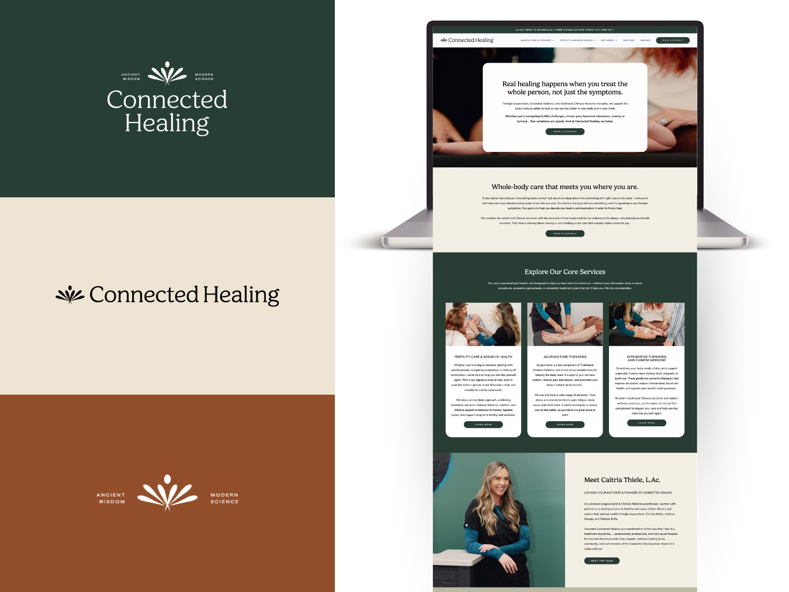
I saw this play out with Connected Healing. They offer both acupuncture services and fertility support, and initially, we could have just made a services page listing everything. But that would have been a missed opportunity.
Instead, we built their navigation around how people actually search. We created parent pages for "Acupuncture & Therapies" and "Fertility & Women's Health," then built out detailed child pages under each. Someone searching for "acupuncture for fertility Milwaukee" lands on a specific page about that exact service. Someone looking for "functional fertility support" finds content speaking directly to their journey.
But here's where it gets strategic—we also implemented custom post types for their blog content and resources, allowing us to create interconnected content clusters. An article about preparing for IVF links to their fertility acupuncture page. A post about hormone balance connects to their functional medicine program. Google sees these connections and understands that Connected Healing has deep expertise in these specific areas.
The result? Her organic traffic increased by 60% in six months, and more importantly, the people finding them were already warm leads who understood their integrative approach.
What this means for you: Your website structure isn't just about making navigation easy—it's about telling Google (and potential clients) exactly what you specialize in. Think about how your ideal clients search, then build your site architecture to match those search patterns.
Lowering the Barrier to Entry (Without Devaluing Your Work)
One of the biggest challenges in health and wellness website design is this: how do you get people into your world when they're not ready to commit to working with you yet?
I worked through this with The Clear Skin Lab, and we approached it from a positioning standpoint that completely shifted how potential clients engaged with them. Instead of positioning the practice as the distant expert you book an appointment with, we positioned them as a supportive big sister who gets it.
Here's what I mean… If you’ve every struggled with chronic skin issues, you know exactly how isolating it can feel. You've tried everything. You’ve been to all he doctors and dermatologists. You feel like your body is betraying you. You're exhausted from people suggesting you just "drink more water" or "try cutting out dairy." You need someone who actually understands before you're willing to invest time and money into another solution that might not work.
So we built an entry point through free resources—guides, masterclasses, practical tips that demonstrate their expertise while building trust. But we also did something else: we humanized the brand through Nutrition by Robyn's Instagram presence. Even though there's a team of practitioners running the practice, putting a face to the brand made the whole thing feel less intimidating and more approachable.
The strategy worked. People would engage with the free content, follow along on Instagram, feel like they knew Robyn and understood the approach, and then when they were ready? Booking felt like the natural best step, not scary.
The positioning principle: When you're asking people to trust you with something vulnerable (their skin, their fertility, their chronic pain), you need to lower the barrier to entry. Free resources that genuinely help people aren't giving away your value—they're demonstrating it. And showing your face, your personality, your real human-ness makes the decision to work with you feel less risky.

Pivoting Your Positioning When Your Business Evolves
Here's something nobody tells you about health and wellness website design: it needs to evolve as your practice evolves. What worked when you started might not match where you're headed.
I saw this happen with Fueled & Free Nutrition. Margaret’s 1:1 program had been successful, but she noticed it was inquiries were starting to dip at the beginning of 2025. Meanwhile, her content about GLP-1s and peptides was getting massive engagement on her podcast and Instagram. People were asking questions, wanting support, but not necessarily fitting into her traditional 1:1 nutrition coaching program.
So she made a strategic pivot. Instead of trying to force more people into a program that wasn't quite matching market demand anymore, we created a new offering specifically around peptide microdosing support. This wasn't abandoning her existing work—it was responding to what her audience was actually asking for.
The website needed to reflect this shift. We repositioned her homepage messaging to lead with the peptide expertise while still maintaining her foundational nutrition approach. We created dedicated pages for the peptide program that spoke to the specific audience discovering her through that content. We restructured the navigation to make both pathways clear.
The result? Her peptide program filled up within weeks, and the clarity actually helped her 1:1 program too, because people could self-select into the right fit for them.
The business strategy lesson: Your health and wellness website design should reflect where your business is going, not just where it's been. Pay attention to what your audience is asking for, what content gets the most engagement, where the energy is flowing. Sometimes the most strategic thing you can do is pivot your positioning to match what people actually want from you—and your website needs to communicate that shift clearly.

The Small Details That Signal You Understand
I was reviewing analytics for a nutrition practice once and noticed something interesting. Their most-visited page after the homepage? Their "what to expect" page explaining the first consultation. That taught me something about health and wellness website design for sensitive specialties. People dealing with fertility challenges, chronic pain, gut issues, or any ongoing health struggle have often been through the medical system already. They've had bad experiences. They need to know what they're walking into before they'll book.
Innate Fertility gets this. They work with both women and men on fertility optimization, and their site addresses the anxiety that comes with trying something new. What happens in the first session? What kind of testing might be involved? How long does the process typically take? Will this work alongside their reproductive endocrinologist's care?
These aren't just nice-to-have details—they're the difference between someone booking or bouncing. When you're dealing with something as emotionally charged as fertility, every unanswered question becomes a reason to keep researching rather than committing.
The actionable takeaway: Map out every question a hesitant potential client might have, then answer them proactively on your site. Don't make people email to ask basic questions about your process, pricing structure, or how you work with their existing medical team. Address it directly in your wellness website design.

When One Program Needs to Speak to Two Different People
This is where health and wellness website design gets really strategic. Sometimes you have one delivery method, but two very different audiences who need to hear different messages.
I navigated this with Kerri Axelrod Nutrition. Her 1:1 functional medicine program is the same process regardless of who books—same comprehensive approach, same testing, same support structure. But here's the thing: someone dealing with gut issues thinks about their problem completely differently than someone navigating perimenopause.
The gut health person is focused on bloating, food sensitivities, digestive distress, and the impact on their daily life. The perimenopause person is dealing with hormonal chaos, weight changes, brain fog, and feeling dismissed by conventional medicine. These are different pain points, different frustrations, different language.
So instead of having one generic "1:1 program" page, we created two distinct program pathways. A Gut Health Program and a Perimenopause Program. Same delivery, but the messaging speaks directly to each person's specific experience. When someone with IBS symptoms lands on the site, they see a program designed for gut health. When someone in perimenopause finds Kerri, they see a program that addresses exactly what they're experiencing. Both feel seen. Both feel like this program was built for them specifically.
The conversion rate? It more than doubled after we made this shift.
The strategic insight: If you serve multiple populations with the same delivery model, don't force them all into one generic offering. Your health and wellness website design should create separate entry points that speak to each person's specific journey, even if they ultimately receive similar support. People don't buy programs—they buy solutions to their specific problems.
The Technical Stuff That Actually Impacts Trust
I once watched someone try to book an appointment with a wellness practitioner on their phone. The booking button was too small to tap accurately. The form kept jumping around as it loaded. The whole experience was frustrating enough that they gave up and moved on to someone else.
That practitioner lost a client not because of their skills or approach, but because their health and wellness website design failed at a technical level.
Mobile optimization isn't optional anymore—most people research health practitioners on their phones, often at odd hours when they can't sleep or during lunch breaks when they finally have time to address their health. If your site doesn't work smoothly on mobile, you're losing more than half your potential clients.
But it goes beyond mobile. Loading speed matters because a slow site subtly communicates disorganization. Clear navigation matters because if people can't find your booking page or pricing information, they'll go somewhere easier. HIPAA-compliant forms matter because you're dealing with health information that needs protection.
These technical foundations aren't sexy, but they're the difference between wellness website design that converts and wellness website design that just looks pretty in screenshots.
The non-negotiables: Test your site on actual mobile devices. Make sure your booking process takes less than two minutes from decision to confirmed appointment. Ensure your contact information is visible on every page. Check that all forms are secure and HIPAA-compliant if you're collecting any health information.
What Connects All Great Health and Wellness Website Design
After working on dozens of these projects, I've noticed that the ones that actually work—meaning they attract ideal clients and support thriving practices—all share certain qualities:
They're specific about who they serve rather than trying to help everyone. They use real imagery that shows the actual practitioner and space. They address concerns and questions proactively. They balance credibility with warmth. They make taking the next step ridiculously easy.
But underneath all that, there's something else. The best wellness website design comes from practitioners who are clear about their value and comfortable owning their unique approach. It's not about following some wellness website template or copying what everyone else does. It's about translating what makes you effective in person into a digital space.
Where Most Health and Wellness Website Design Goes Wrong
The most common mistake I see? Practitioners trying to make their website look like what they think a wellness site "should" look like, rather than what actually represents their practice.
This usually means falling into wellness clichés—the soft pastels, the eucalyptus leaves, the woman doing yoga at sunset, the vague language about "supporting your journey to wellness." None of this is inherently wrong, but if it doesn't authentically represent how you actually work, it's creating a disconnect.
The second most common mistake is hiding important information. I can't tell you how many wellness websites I've seen where pricing is completely mysterious, the booking process requires multiple steps and emails, or basic questions about services and approach go unanswered.
If you're making people work hard to figure out how to work with you, many will simply move on to someone who makes it easier.
Moving Forward With Your Own Wellness Website Design
If you're working on your own health and wellness website design, here's what I'd focus on:
Get brutally specific about who you serve and what transformation you facilitate. Use that clarity to drive every design decision. Invest in real photography or at least authentic imagery that shows you and your space. Write like you talk—let your actual personality come through rather than defaulting to generic wellness language.
Answer every question a hesitant potential client might have. Make your booking process smooth and mobile-friendly. Own what makes your approach unique rather than trying to appeal to everyone.
And remember that your website isn't just a digital business card. It's often the first place someone who's been struggling gets to feel hope that maybe, finally, someone understands what they're going through.
That's worth getting right.
Want to explore our design portfolio? Check out our past work here
Want to build a website for your health practice or wellness space? Click here to inquire and book a free strategy call
For more insights on creating effective wellness websites, check out my other posts on web design for holistic practitioners and website design for integrative medicine practices.