Top 7 Nutrition Website Design Projects for Inspiration
Let's be honest: most nutrition websites look exactly the same. You know the ones I'm talking about. The generic green color palette. The inevitable photo of a salad bowl from above. The smiling woman in athleisure holding a smoothie. The vague promises about "wellness" and "balance" that could apply to literally anyone.
Here's the thing—when every nutrition website looks identical, nobody stands out. And when you're a nutrition professional with a specific expertise, a unique approach, and real transformations to share, that generic template isn't doing you any favors.
So let me show you something different. These are seven nutrition website design projects that actually work—not because they follow some trendy formula, but because they authentically represent the practitioners behind them and speak directly to the people they're meant to serve.
Whether you're looking for nutrition coach website design inspiration or trying to figure out how to showcase your specialized approach, these real examples will show you what's possible when design meets strategy.
1. The Clear Skin Lab: When Nutrition Meets Dermatology
What makes it special: The Clear Skin Lab tackles something most nutrition websites ignore—the emotional weight of chronic skin issues. This isn't just about acne or eczema; it's about how skin conditions affect confidence, relationships, and quality of life.
Design choices that work: The visual approach is clean and clinical without feeling cold. The color palette is sophisticated and calming—no harsh whites or sterile blues. Instead, you get warm neutrals that feel both professional and nurturing. What really stands out is how the site bridges nutrition and functional medicine credibility with genuine empathy. The homepage immediately acknowledges the frustration of trying everything and not seeing results. That's the kind of specificity that makes people feel seen.
What you can learn: This is masterclass nutrition website design for specialized practices. Notice how they don't try to help everyone with everything. They've carved out a specific niche (skin health through functional nutrition) and own it completely. The messaging, imagery, and overall feel all support this singular focus. If you're a nutritionist specializing in any condition beyond general wellness, pay attention to how Clear Skin Lab makes their specialty immediately obvious while still communicating the broader functional medicine approach that underpins their work.

2. Fueled & Free Nutrition: Speaks to Women and Moms Who Are Going Through Perimenopause
What makes it special: Perimenopause and peptides—now that's a specific combination you don't see every day. Fueled & Free Nutrition demonstrates how powerful it is to speak directly to one demographic going through one specific life stage.
Design choices that work: The visual identity feels energetic and empowering, not apologetic or "anti-aging" focused. This matters enormously when your audience is women who are tired of being told their bodies are problems to fix. The content strategy is brilliant—it educates about hormones and peptides in a way that's accessible without being condescending. You leave understanding why this approach works, not just what services are offered.
What you can learn: This is nutrition coach website design that understands its audience deeply. Women in perimenopause aren't looking for generic wellness advice. They're looking for someone who gets the specific hell of hormonal chaos, weight changes despite doing "everything right," and energy crashes that conventional doctors dismiss.
Notice how the design and messaging work together to say: "I see you, I understand what you're going through, and I have specific solutions." That's infinitely more powerful than "I help women with nutrition."
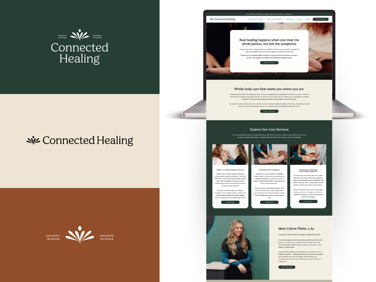
3. Connected Healing: East Meets West in Fertility Support
What makes it special: Connected Healing bridges two worlds that don't always communicate well—Chinese medicine and functional fertility support. The nutrition web design needed to honor ancient wisdom while feeling completely contemporary and evidence-based.
Design choices that work: The aesthetic manages to feel both grounded and hopeful, which is exactly what people struggling with fertility need. It's not overly precious or filled with baby imagery that might feel painful to visitors. Instead, it focuses on the journey and the support. The integration of acupuncture, Chinese medicine principles, and functional nutrition is explained clearly without overwhelming. Each modality gets its moment to shine while the overall message remains cohesive: comprehensive, integrative fertility support.
What you can learn: This website demonstrates how to position multiple complementary services without confusing visitors. The navigation is intuitive, the messaging is clear about how different approaches work together, and there's no competition between modalities—just a unified vision of fertility support.
For nutritionists who incorporate other wellness modalities (yoga, mindfulness, herbal medicine), this shows how to present a holistic practice without diluting your core expertise in nutrition.

4. Innate Fertility: Inclusive Functional Fertility Care
What makes it special: Innate Fertility stands out by being explicitly inclusive—they work with both women and men on fertility optimization. This broader approach required website design for nutrition and health that spoke to multiple audiences without losing focus.
Design choices that work: The visual identity is sophisticated and science-forward. This matters in the fertility space where people want to know you understand the complexity of reproductive health, not just "eat more vegetables." What's particularly effective is how the site structures information for different visitor types. Whether you're a woman with PCOS, a man concerned about sperm health, or a couple trying to optimize together, there's a clear path for you.
What you can learn: This is excellent nutrition and diet consulting web design for practices that serve multiple demographics. Notice how they maintain one cohesive brand while creating distinct pathways for different visitor needs.
The content strategy is also worth studying—it's educational without being overwhelming, technical without being inaccessible, and hopeful without making promises no ethical practitioner should make.

5. The Pohlman Institute: The Diabetes Dietitian Who Gets It
What makes it special: Blood sugar management and diabetes nutrition is a crowded space. The Pohlman Institute differentiates by positioning around the frustration of managing diabetes—the constant vigilance, the guilt when numbers are off, the exhaustion of it all.
Design choices that work: The design feels calm and organized, which mirrors what the practice offers: a structured, supportive approach to something that often feels chaotic. The color palette and layout communicate stability and expertise without feeling rigid or judgmental. The site does something brilliant: it normalizes the emotional experience of diabetes management. It acknowledges that this isn't just about food choices—it's about living your life while managing a chronic condition.
What you can learn: This nutrition website design showcases how to position specialized expertise. The Pohlman Institute doesn't try to be all things to all people. They're diabetes and blood sugar specialists, period. This clarity makes decision-making easy for visitors—either you need this specific help or you don't. Notice also how they handle the educational content. There's substantial information about diabetes management, but it's organized in a way that doesn't overwhelm. You can dive deep if you want, or get the essentials and book a consultation.

6. Kerri Axelrod Nutrition: Functional Gut Health Meets Perimenopause
What makes it special: Kerri Axelrod combines two specialties that often co-occur but aren't always addressed together: gut health and perimenopause. The nutrition coach website design needed to communicate this dual expertise while maintaining a cohesive brand.
Design choices that work: The visual identity has a sense of luxury and isn’t designed to be just another generic wellness brand. The design choices reflect Kerri's actual approach and personality, which makes the site feel authentic rather than templated.
What's particularly effective is how the site positions functional medicine as the framework that connects gut health and hormones. It's not two separate services randomly offered by the same person—it's one comprehensive approach to interconnected issues.
What you can learn: This demonstrates how to showcase your personality in professional nutrition web design. There's a clear point of view here, a specific way of working, and an identifiable brand voice. This attracts ideal clients and naturally repels those who wouldn't be a good fit.
The content strategy also deserves attention—it educates about the gut-hormone connection in a way that makes complex physiology accessible and interesting. This positions Kerri as the expert while helping potential clients understand why they might need this specific combination of expertise.

7. The Nutrition Circle: Intuitive Eating and Pregnancy Nutrition in Melbourne
What makes it special: The Nutrition Circle is a Melbourne-based practice that combines three specialties beautifully: intuitive eating, pregnancy nutrition, and gestational diabetes management. This unique combination required nutrition website design that could speak to very different client needs while maintaining a cohesive message.
Design choices that work: The visual approach feels warm and non-judgmental—essential when working with intuitive eating principles that actively push back against diet culture. The design communicates expertise without the clinical coldness that might alienate someone seeking a more holistic, body-positive approach.
What's brilliant is how the site navigates the space between intuitive eating (which rejects rigid rules) and gestational diabetes management (which requires structure and monitoring). The design and messaging honor both philosophies without creating contradiction.
The pregnancy and motherhood focus comes through in imagery and tone that feels supportive rather than prescriptive. This matters enormously when working with a population that's often bombarded with conflicting nutrition advice.
What you can learn: This nutrition and diet consulting web design demonstrates how to serve a geographic area (Melbourne) while also communicating specialized expertise that could attract people from beyond your immediate location (especially for virtual consultations).
Notice how they position three distinct specialties without fragmenting their brand. The through-line is supporting women through significant life transitions with evidence-based, compassionate nutrition care that respects their relationship with food and their body.
For nutritionists who practice intuitive eating or work with pregnancy nutrition, pay attention to how The Nutrition Circle communicates structure and expertise without falling back into diet culture messaging. That's a delicate balance they've managed beautifully.
Common Threads: What Makes These Nutrition Website Designs Actually Work
Looking across all seven projects, several patterns emerge that separate effective nutrition coach website design from generic templates:
Specificity Over Generalization Not one of these sites tries to help "everyone with nutrition." Each has carved out a specific niche—whether that's skin health, perimenopause, fertility, diabetes, or gut health. This clarity makes it easy for the right people to self-identify and easy for the wrong people to move on.
Authentic Visual Identity None of these sites look like they came from the same template. Each has a distinct visual personality that reflects the actual practitioner and approach. This matters enormously in a field where differentiation is challenging.
Education-Forward Content Every single site prioritizes helping visitors understand both the problem they're experiencing and why this specific approach might help. This educational content does the heavy lifting of positioning the practitioner as an expert while building trust.
Clear Pathways to Action Whether it's booking a consultation, scheduling a discovery call, or joining a program, each site makes the next step obvious and accessible. There's no mystery about how to work with these practitioners.
Emotional Intelligence These aren't just about nutrition science—they acknowledge the emotional, psychological, and lifestyle dimensions of changing how you eat and care for your body. This emotional intelligence shows up in the copy, the imagery, and the overall tone.
What This Means for Your Nutrition Website Design
If you're working on nutrition and diet consulting web design for your own practice, here's what to take away from these examples:
Get Specific About Who You Serve "I help people eat healthier" isn't a positioning statement—it's a guarantee you'll blend in. Who specifically do you help? What specific outcomes do you facilitate? What makes your approach different?
Let Your Personality Show Your ideal clients aren't looking for a generic nutritionist. They're looking for someone whose approach, personality, and values align with theirs. Let that show in your design, copy, and overall brand.
Invest in Professional Design Notice that none of these sites look DIY or template-based. Professional nutrition website design is an investment, but it's one that pays dividends in credibility, conversions, and the ability to charge what you're worth.
Create Educational Content Your website shouldn't just list services—it should demonstrate your expertise and help potential clients understand their situation better. Blog posts, resources, and clear explanations of your approach all contribute to this.
Make Booking Ridiculously Easy Every friction point between "I'm interested" and "I have an appointment" costs you clients. Online scheduling, clear pricing information, and multiple contact methods all reduce friction.
The Technical Foundations That Support Great Design
While aesthetics matter, these nutrition website design projects all share solid technical foundations:
Mobile optimization that works flawlessly (most nutrition searches happen on phones)
Fast loading speeds that don't test visitor patience
Clear navigation that makes information easy to find
HIPAA-compliant forms where health information is collected
Integrated scheduling that syncs with practice management systems
SEO optimization that helps ideal clients actually find the site
Beautiful design on a slow, clunky, or hard-to-navigate site is like gorgeous packaging for a product nobody can open. The technical stuff matters.
Beyond Launch: These Sites Are Living, Evolving Spaces
One final observation: none of these nutrition web design projects are static. They evolve as the practices grow, add new offerings, or refine their messaging. Your website should do the same.
This means:
Regularly updating content to stay relevant
Adding new blog posts that address client questions
Updating photos and testimonials as your practice evolves
Refining messaging based on what resonates with your audience
Adding new services or programs as you develop them
A website isn't a "set it and forget it" project—it's a living representation of your practice that grows and changes alongside you.
Your Next Steps
If you're feeling inspired and ready to create or upgrade your nutrition website design:
First, get crystal clear on your niche and what makes your approach unique. Every design decision flows from this clarity.
Second, gather inspiration from sites you love (including these seven) and articulate what specifically appeals to you. This helps communicate your vision to a designer.
Third, consider working with a designer who specializes in website design for nutrition and health. They understand the unique challenges and opportunities in this field.
Fourth, think beyond launch. What content will you create? How will your site evolve? What do you need to support your practice growth?
The Bottom Line
These seven nutrition website design projects prove that you don't have to look like every other nutritionist online. You can create something that authentically represents your expertise, speaks to your ideal clients, and stands out in a crowded field.
The key is specificity, authenticity, and strategic design that serves both your vision and your visitors' needs. When you get that right, your website becomes your hardest-working team member—attracting ideal clients, positioning you as an expert, and supporting your practice growth 24/7.
That's what exceptional nutrition coach website design does. And that's exactly what these seven projects demonstrate in their own unique ways.
Ready to create something equally compelling for your nutrition practice? Click here to inquire and book a free strategy call!