Creating Pretty Personal Brand Logos That Tell Your Story
Okay, real talk. Your personal brand logo is probably the first thing people see when they find you online. And yeah, it needs to look good—but here's what most people miss: a really great personal branding logo does so much more than just sit there looking cute in your Instagram bio.
I've been designing personal logos for wellness entrepreneurs, content creators, and health practitioners for years now, and I've learned that the difference between a logo that just exists and one that actually works for your business comes down to strategy. Always strategy first, then pretty.
So in this post, I'm walking you through some of my favorite personal brand logos I've created—each one with its own story, its own vibe, and most importantly, its own purpose.
What Actually Makes a Personal Brand Logo Work?
Before we get into the fun stuff (aka the pretty portfolio pieces), let's talk about what separates the meh logos from the ones that make people stop scrolling.
The personal branding logos that actually do their job? They're authentic to who you are, not who you think you should be. They stick in people's heads without trying too hard. They look just as good on your website as they do squeezed into your email signature. And honestly, they shouldn't feel dated six months from now (I'm looking at you, 2019 millennial pink phase).
But here's the thing that matters most: they need to feel both professional and approachable. Because you're not a faceless corporation—you're a person building a business, and your brand should reflect that.
Personal Logo Ideas: A Portfolio Journey


Kerri Axelrod — Functional Nutrition and Wellness
So Kerri came to me with this challenge that I see all the time in the wellness space. She's a functional medicine nutritionist helping high-performing women deal with gut issues, perimenopause, all of it. But she needed a brand that felt scientifically legit without being cold or clinical. That balance is tricky.
We went with this gorgeous serif wordmark that just exudes quiet confidence. The kind of design that says "I know what I'm doing" without being in your face about it. The "KA" monogram has this elegant ligature that feels refined but still warm.
And the colors? Intentional as hell. We used rich charcoal and warm umber to ground everything with authority, then softened it with bone and isabelle (this creamy off-white that I'm obsessed with). Baby powder acts as our gentle neutral—warm enough that it never feels like you're in a doctor's office.
The whole brand mood board pulls from natural textures, cozy linen, soft shadows, handwritten notes. Everything reinforces that this is personalized, high-touch care that actually helps you feel better, not just another practitioner throwing supplements at you.
Check out kerriaxelrod.com and you'll see how the whole thing comes together. Her tagline alone—"Your symptoms aren't random, they're a roadmap to real answers"—perfectly captures the brand promise, and the design backs it up at every turn.

Niomi Smart — Wellness & Mindful Living
Niomi's been in the wellness and lifestyle content space for over a decade. She's built this incredible community around spirituality, self-growth, and holistic living. But her brand needed to honor where she's evolved to—this deeper, more intentional space—while still feeling sophisticated enough for the audience she's cultivated.
We created something that feels both grounded and ethereal (which is harder than it sounds, trust me). The personal brand logo has these soft, flowing forms that capture her whole "awakening your inner wisdom" philosophy without being too woo-woo about it.
The visual identity centers on natural elements, earthy tones, and this sense of spaciousness that lets people breathe. Because that's what her philosophy is all about: creating connection, embracing authenticity, fostering community that feels like soul family.
Head over to niomismart.com and you'll feel it immediately. The website flows like a gentle meditation—plenty of breathing room, design choices that actually make you want to slow down and connect. Her brand pillars (self-growth, authenticity, connection, wellness) are woven throughout without being preachy.

Sophie Dear — The Self-Worth School
Sophie's story hits different. She's a life coach and yoga teacher who helps women break free from their inner critic and people-pleasing patterns. After years in TV, burnout, divorce, health struggles—she rebuilt her entire life through inner work. So her brand needed to feel compassionate and gentle, but also rooted in real transformation. Not that toxic positivity garbage.
We created this warm, inviting personal branding logo that balances softness with actual strength. The typography feels approachable and human (because Sophie is), and the overall aesthetic communicates "this is a safe space for vulnerable growth."
Every design choice reinforces that living a life of balance, purpose, fulfillment and freedom isn't just some Instagram caption—it's actually possible. The visual language speaks to ease and authenticity, the kind of gentle self-compassion that creates lasting change instead of just making you feel worse about yourself.
Sophiedear.com embodies this completely. From the Self-Worth School to her yoga classes and retreat experiences, the brand creates immediate trust. The design whispers instead of shouts, which is exactly what her audience needs.
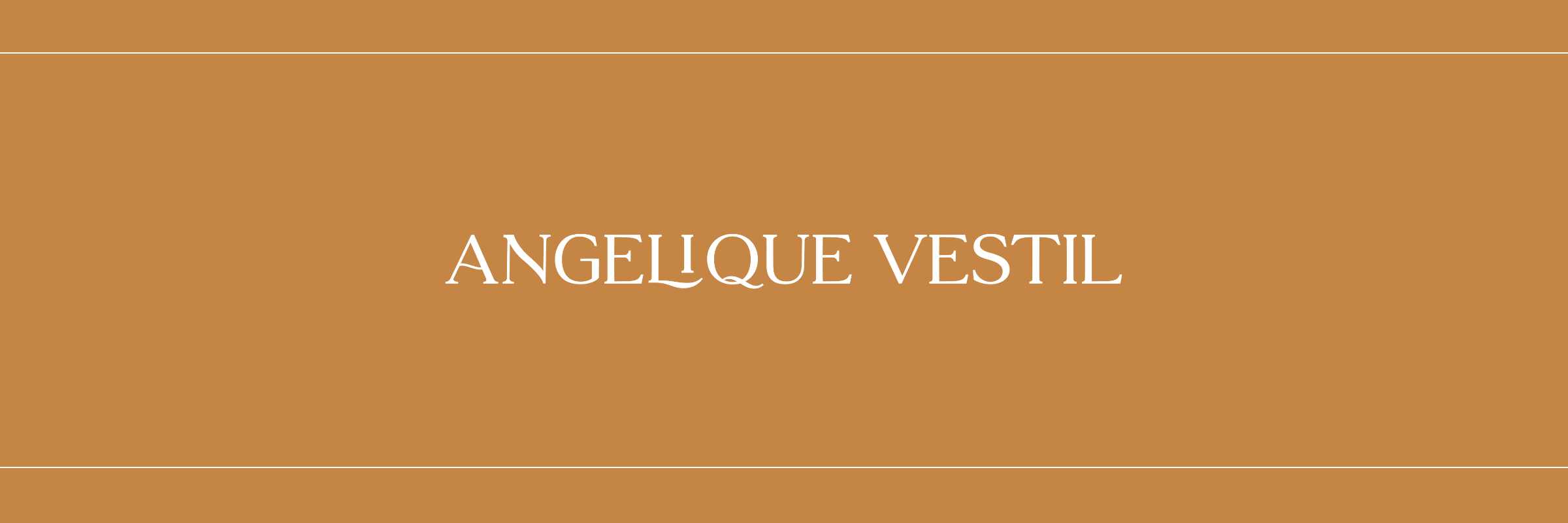
Angelique Vestil — Creative Studio for Wellness Brands
Okay, this one's mine (hi!). And honestly? Designing for yourself is THE HARDEST. I'm a funnel expert turned graphic designer who creates brands for health, wellness, and beauty entrepreneurs. I needed my own brand to showcase my design aesthetic while proving I actually understand marketing strategy.
My personal logo and brand identity needed to be artful but strategic. Pretty enough to attract wellness brands who want elevated design, polished enough to show I'm serious about the business side. The aesthetic had to showcase my ability to craft "mindful designs" that aren't just beautiful—they convert.
This site you're on right now (angeliquevestil.com)? It's an example of how my personality shines through while still doing its job as a marketing funnel. Every element nurtures you through the customer journey. Because I don't just make things look good—I make them sell.
Celest Pereira — Anatomy, Neurology & Movement
Celest is a physiotherapist and yoga teacher trainer specializing in functional neurology. She teaches yoga anatomy and biomechanics, which means she needed a brand that could bridge the gap between serious scientific education and the wellness world. Appeal to yoga teachers without losing credibility with her physio background.
We went clean and modern. Accessible without dumbing anything down. Because Celest "makes complex concepts easy to grasp," and her brand needed to reflect that approachability while honoring how deep her expertise actually goes.
The visual identity had to work across her AnatoMove app, her 200-hour yoga teacher training, her book "Too Flexible to Feel Good," her podcast—all of it. So we created a design system that balances educational authority with the warmth and personality that makes her such an engaging teacher.
At celestpereira.com, you immediately get the vibe: you're in the right place if you love movement and anatomy and you don't take yourself too seriously. The design is clean and organized (because anatomy education is systematic), but it maintains the warmth that keeps students coming back to her "Love @ First Science" podcast.
Why These Pretty Logos Actually Work: The Strategy Behind Them
Here's what I want you to notice about all these personal logos ideas. Yes, they're beautiful. But more importantly? They're strategic as hell.
Every single one emerged from deep discovery work. Not just "what do you do" but who do you serve, how do you want people to feel, what transformation are you creating. The color psychology is thoughtful—every shade chosen to evoke specific emotions and attract the right audience. Typography reinforces brand personality, whether that's Kerri's sophisticated serifs or Sophie's gentle, approachable letterforms.
We created complete brand identities, not just logos floating in space. Mood boards, color palettes, design guidelines. And everything needed to be versatile—working on website headers, Instagram stories, email signatures, all of it.
If You're Ready to Create Your Personal Brand Logo
Start with your why before you even think about colors or fonts. Get clear on your mission, values, and the transformation you create. Your personal branding logo should be a visual representation of this foundation, not just something that looks nice.
Define your brand personality. Are you warm or bold? Minimalist or maximalist? These aren't random aesthetic choices—they should align with how you want your ideal clients to perceive you.
Think about your complete ecosystem. Your logo doesn't live in isolation. Consider your website, social media, email marketing, physical materials if you have them. The strongest brands maintain consistency across every touchpoint.
And look, while DIY tools have their place, investing in professional design gets you strategic, polished results that will actually serve your business for years. These pretty logos didn't happen by accident.
Build a complete brand identity, not just a logo. The real magic happens when you develop a full visual system—color palettes, typography, graphic elements, photography style, mood boards that guide all your design decisions.
Your Personal Brand Logo Is Just the Beginning
Your personal brand logo appears on everything. Website header, email signature, social media profiles, business cards. It's the visual foundation of your entire brand identity, which means it's worth getting right.
Whether you're just starting or ready to refresh an outdated logo, investing in strong personal branding transforms how you present yourself to the world. The right logo doesn't just look good—it tells your story, connects with your ideal clients, and gives you the confidence to show up consistently.
Each brand featured here started with a conversation, a vision, and a commitment to creating something that truly represents who they are. If you're ready to create a personal brand that feels authentically you AND strategically positions you in your market, let's talk about bringing your vision to life.
Want to explore our design portfolio? Check out our past branding projects here
Want to build a website for your health practice or wellness space? Click here to inquire and book a free strategy call