Top Medical and Wellness Logo Design: Real Examples To Inspire Your Practice
The Nike swoosh has nothing to do with shoes. The Apple logo has nothing to do with computers. And the best medical and wellness logos have don’t always have to exactly depict the service being offered.
What they should DEFINITELY do instead is create a feeling. The feeling of walking into a space and knowing immediately whether you belong there and if this practice feels like the right fit.
I've been designing websites and logos for health and wellness practitioners for over seven years, and the logos that perform best for my clients aren't the ones that include the most obvious symbols. They're the ones where a patient lands on a website and feels something specific: calm, confident, seen, or like they finally found the right person. That feeling is the goal. The logo is what carries it.
Below are over a dozen of real projects from my logo design portfolio, each with a different specialty, a different patient, and a completely different emotional brief we we’re trying to achieve!
Why the vibe of your medical logo matters way more than just the symbol
Most practitioners come into a branding project thinking about what their logo should include. A leaf for nutrition, a ribbon for fertility, a brain for therapy. Those instincts make sense, but they're also exactly why so many health and wellness logos end up looking interchangeable.
The smarter question isn't "what symbol represents my work?" It's "how should someone feel the moment they encounter my brand?"
Think about the patient you most want to attract and what emotional state they're in when they're searching for you. A woman who's been navigating fertility challenges for two years is in a completely different emotional place than someone shopping for aesthetic injections. The logo, the colors, the type choices, all of it contributes to whether that specific person feels like they've found somewhere they belong. That's what health and wellness branding is actually doing, not labeling, but connecting.
Medical Spa Logo Design: Branding Examples
Elevated by Chisell: Medical Aesthetics Spa
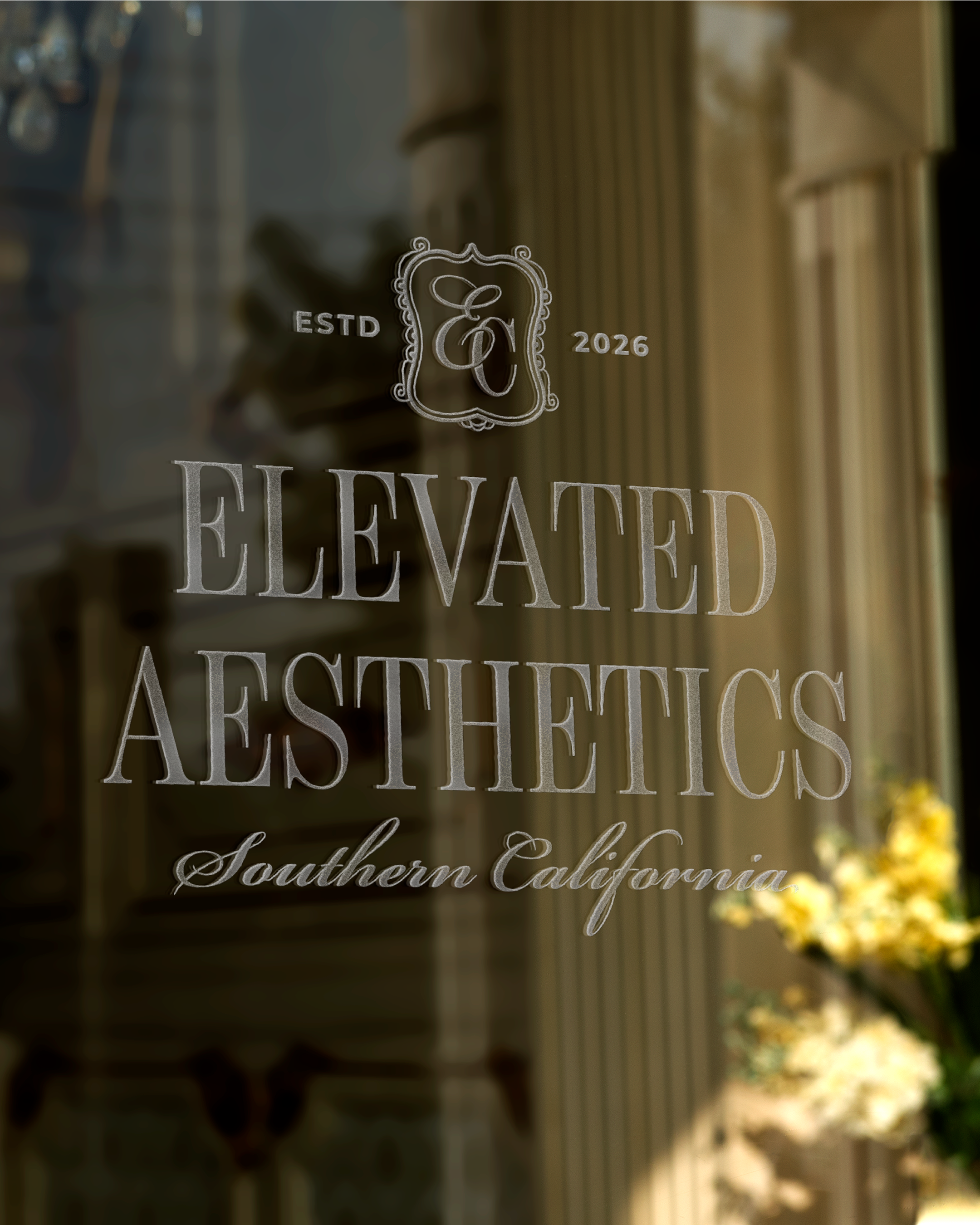
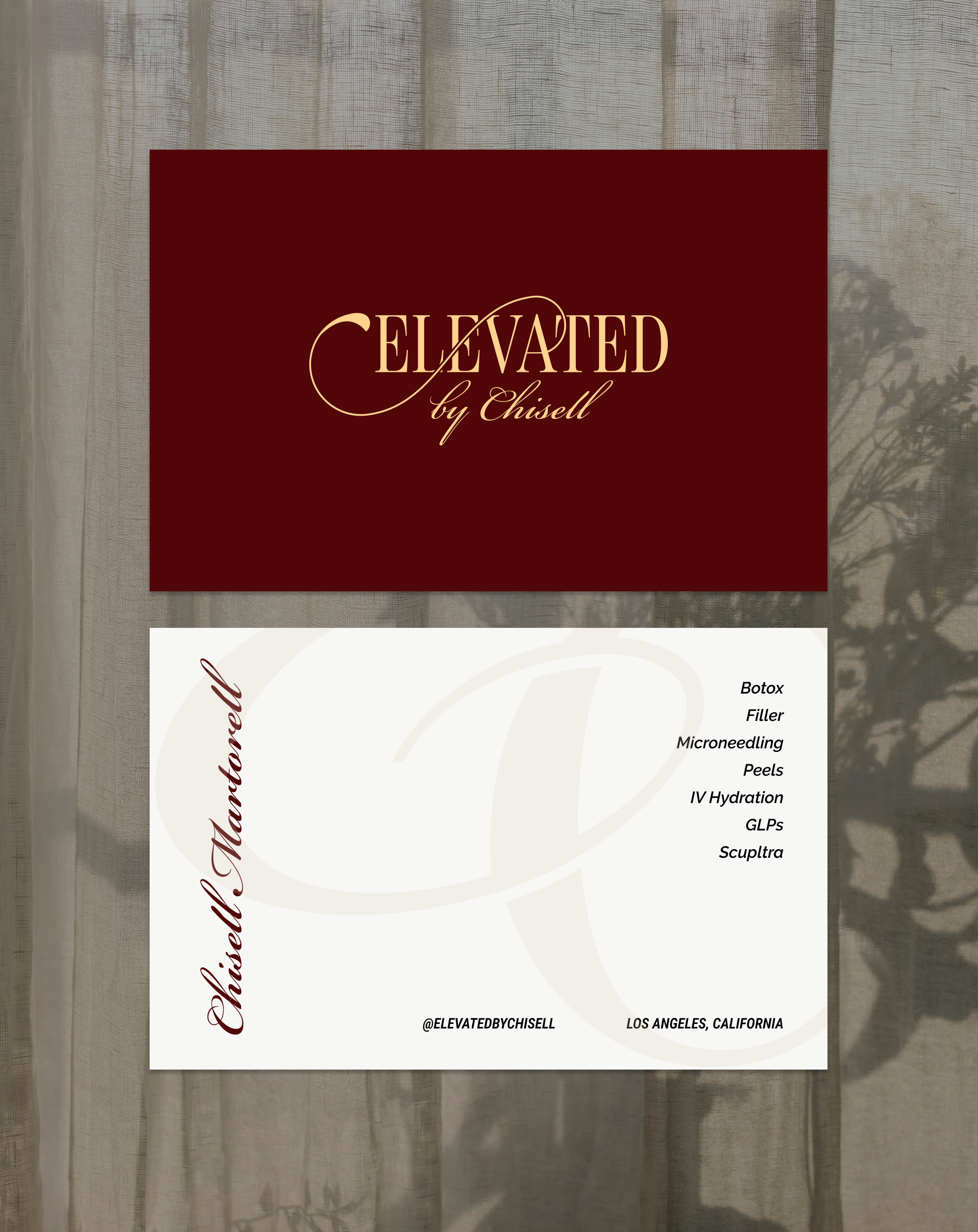
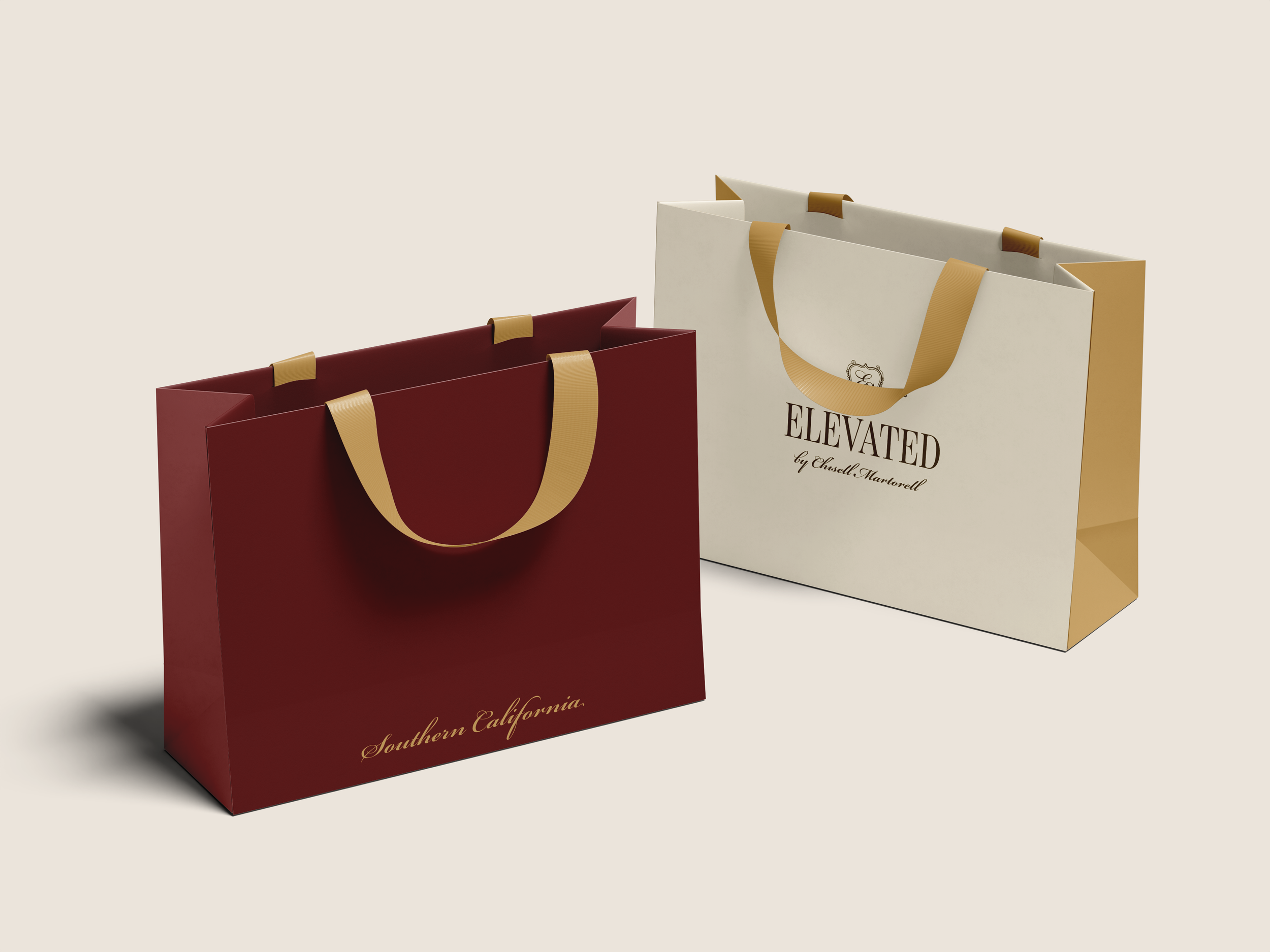
Elevated by Chisell is a luxury aesthetic injector based in LA who wanted to build her own personal brand, with the plans to opening up her own med spa clinic in the future. The project included brand strategy, brand identity, and luxury logo design.
The brand identity brief was to design something where country club chic meets Ralph Lauren, and the goal was a brand that feels elevated and premium without being cold or unapproachable. A med spa client isn't just booking a procedure, they're deciding whether the experience will match what they're investing, and the brand sets that expectation before the appointment is ever made. Every design decision was also built with scalability in mind, so the identity can grow into a full clinic without needing to be rebuilt from scratch.
Health and Wellness Logo Design: Branding Examples
Connected Healing: Acupuncture and Integrative Therapy Clinic

Acupuncture & Integrative Medicine in Milwaukee, Wisconsin | Branding & Logo Design
Connected Healing is an integrative therapy and acupuncture practice specializing in fertility, women's health, and whole-body care. The project included brand identity, website design, copywriting, and SEO.
The logo mark is one of my favorites from the portfolio. What looks like a botanical sprig is actually a symbol of sperm and egg, designed to be felt rather than read. You sense the fertility connection without it ever reading as clinical or heavy-handed. The palette of deep forest green, terracotta, warm sage, and cream reinforces that groundedness throughout the whole identity. The brand vibe was "ancient wisdom meets modern science," and every visual decision was made to give a patient that feeling of being held and at home before they've read anything.
Fertility Clinic Logo Design: Branding Examples
The Functional Fertility Clinic
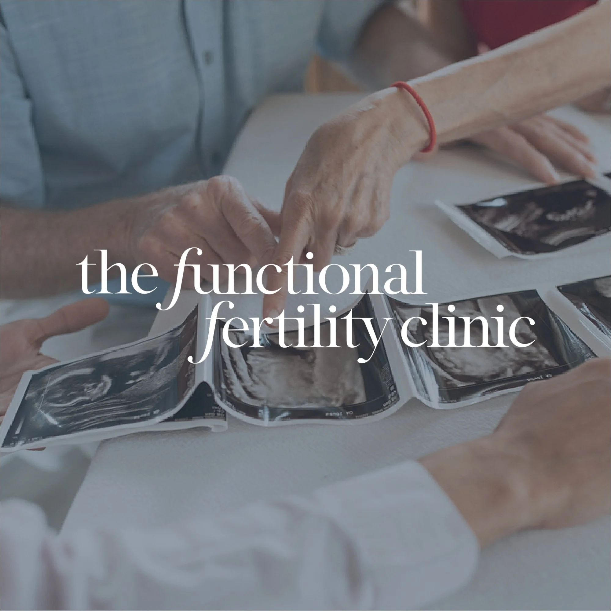
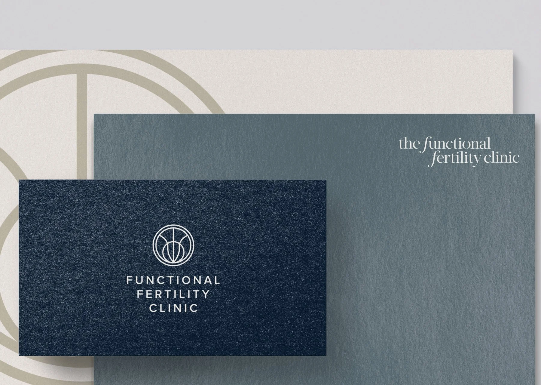
The Functional Fertility Clinic specializes in root-cause fertility care, blending functional nutrition with health coaching.
Fertility branding is emotionally complex in a way most niches aren't. The person finding this practice is often carrying grief and hope at the same time, and a brand that leans too hard into either direction misses the mark. The direction for this project was grounded and credible with warmth built in: earthy, intentional, and specific enough to communicate that this practice has a real methodology behind it. The feeling we were going for was "you're going to be okay, and you're also going to be taken seriously."
Nurture Your Fertility
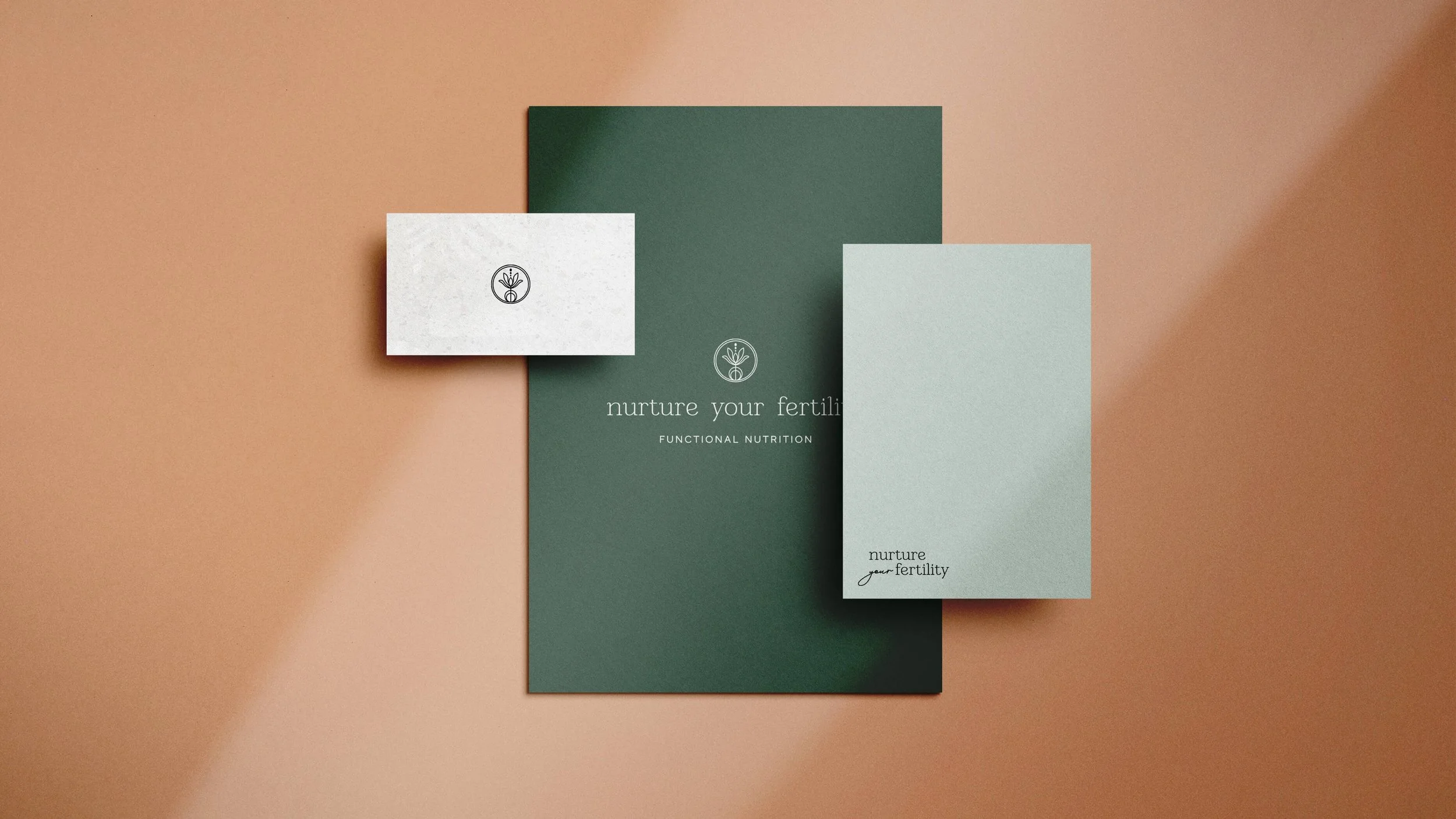
Logo Design & Branding for a Functional Fertility Nutrition Telehealth Practice
Nurture Your Fertility was co-created by Amanda and Erin at Hormone Healing RD as a space where functional nutrition meets fertility support.
Nurture Your Fertility needed to feel like a sister brand to the founder’s primary brand Hormone Healing RD. We wanted it to feel approachable, and like you’re being held. The name itself signals it: nurture is a warm word, and the brand had to live up to that. The visual direction leaned feminine and gentle without losing credibility, and when you land on it, you feel like this is a space where you'll genuinely be cared for.
Nutritionist Logo Design: Branding Examples
The Nutrition Circle: Dietitian Clinic

Nutritionist Brand Identity & Logo Design for Clinic based in Melbourne, Austrailia
The Nutrition Circle is a Melbourne-based nutrition practice covering women's health, fertility, eating disorders, and sports performance. The project also included a full platform migration from Weebly to Kajabi to support their coaching programs and nutrition courses.
The range of clients here made this brief genuinely interesting: the brand couldn't skew too far toward any one emotional register without alienating the others. The direction was minimal, modern, and playful with a clean feminine energy, and the pattern work is what really brings the personality through. It's fun and distinctive without being loud, and the feeling it creates is confident and at ease, welcoming enough to work for a lot of different women while still feeling specific enough to be memorable.
The Pohlman Institite: Diabetes Dietitian
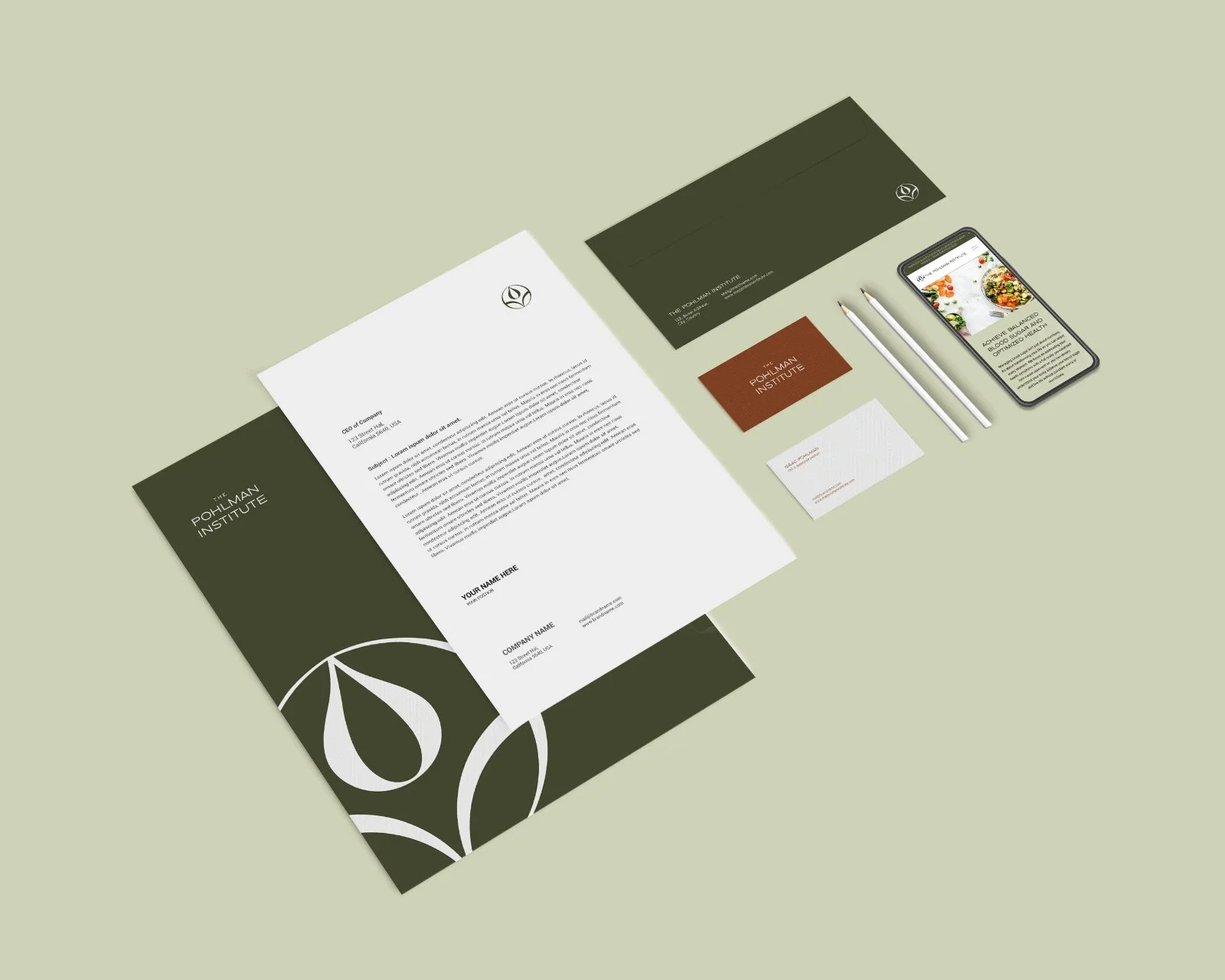
dietitian branding and website design for a private practice based in Chicago, IL
The Pohlman Institute is a nutrition and health private practice focused on helping people address their health symptoms through a full-body, root-cause approach, with a specific emphasis on blood sugar balance and understanding how the body communicates through symptoms.
The brief for this one was earthy and nurturing, but the visual direction intentionally moved away from the soft, feminine palette that dominates the nutrition space. The Pohlman Institute works with a broad range of clients, and the brand needed to feel grounded and approachable without the daintiness that often comes with health and wellness branding. Warm, earthy tones, clean typography, and an overall feeling of trustworthiness: this is a practitioner who takes your symptoms seriously and has a real methodology for addressing them.
Nourish With Kathy: Women’s Health & Pediatrics Dietitian



Nourish with Kathy is a women's health and pediatric dietitian practice built around a simple but powerful idea: stop dieting, start nourishing. The brand needed to feel warm and approachable enough for a mom researching nutrition support for herself and for her child. The goal was to create a grounded, yet memorable brand h for a woman navigating hormone health or cycle regulation.
Therapist Logo Design: Branding Examples
Medley & Mesaric Therapy Associates
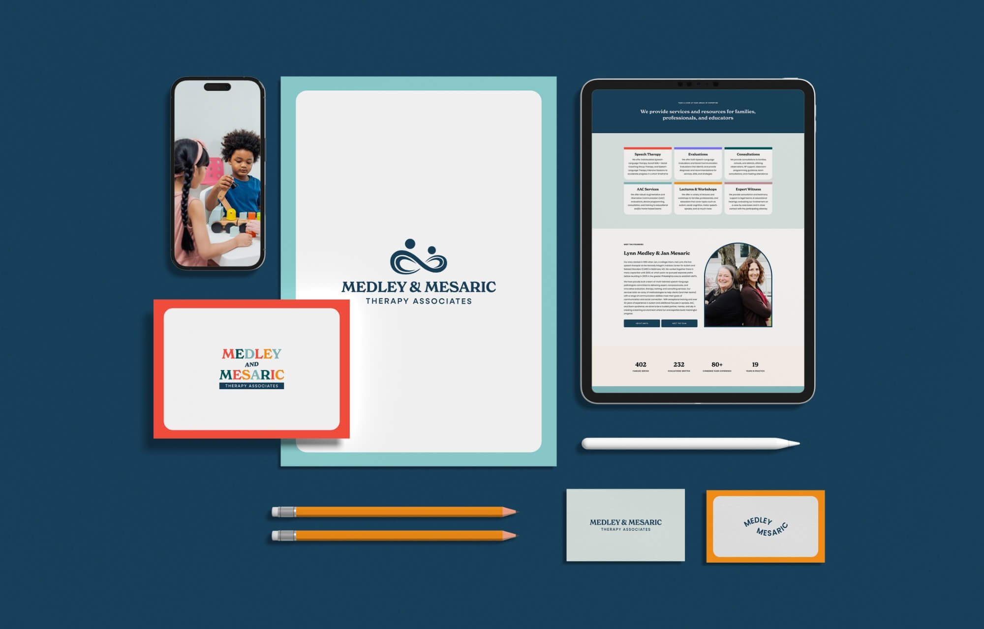
Branding and Logo Design for a Speech Therapy Private Practice in Ambler, PA
Medley & Mesaric Therapy Associates is a speech language therapy private practice supporting a wide variety of communication profiles including autism, apraxia, and Down syndrome.
The logo mark shows a therapist and child working hand in hand, which is exactly what the practice does, but the mark alone isn't what makes the brand work. Because this practice primarily serves children, the design leaned into color and playfulness very intentionally. The goal was never to look clinical. It was to make a tired, worried parent land on the site and immediately feel that their kid is going to like it here, and the colors do that before the copy even gets a chance to.
Functional MEDICINE Logo Design: Branding Examples
Fueled & Free Nutrition

Functional Nutrition Logo Design for Health & Wellness Brand
Fueled & Free is a high-touch functional nutrition practice offering specialty lab testing, GLP-1 and peptide microdosing support, and 1-on-1 nutritional therapy. The project included a full rebrand and a new WordPress website.
The brief was coastal, light, and minimal with a pop of color, and the goal was to create something that felt like a real clinical practice without any of the heaviness that often comes with functional medicine branding. The patient coming to Fueled & Free has usually already tried a lot of things and wants clarity, not more noise, so the visual identity needed to feel organized, credible, and genuinely fresh compared to what else is out there in this space.
The Clear Skin Lab
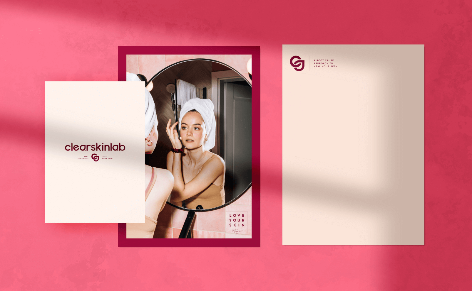
Feminine Branding for Functional Medicine Telehealth Practice for Chronic Skin Issues
The Clear Skin Lab is a functional medicine nutrition practice helping women clear chronic skin flares for good, focused on root cause rather than surface-level management.
The positioning brief was "big sister brand in the chronic acne industry," and that framing shaped every design decision. The custom wordmark uses geometric letterforms with rounded edges that feel youthful and sophisticated at the same time, with a custom "A" that references a water droplet and circular shapes that carry a sense of wholeness throughout. The brand communicates something like: I've been where you are, I figured it out, and I'm going to help you do the same. Vibrant, warm, and confident without being clinical, and when the client saw it for the first time, her response was: "I think my jaw actually dropped."
Physician & Medical Doctor Logo Design: Branding Examples
Chase Health by Dr. Rebecca Chase

brand identity & logo design for telehealth physician and doctor based in Ottawa, Canada
Chase Health was created by Dr. Rebecca Chase to provide proactive, science-backed women's healthcare for women in midlife. The project included medical logo design, brand strategy, brand identity, and UX/UI design.
The brief was to break the mold for traditional healthcare branding. Doctor Rebecca Chase wanted to be the women's health physician who totally resonates with Gen Z and makes metabolic health feel accessible rather than intimidating, and most conventional healthcare and medical brands for women weren't doing that. The design went bold and feminine, with hand-drawn illustration elements that add personality and warmth throughout the identity. The feeling it creates is something like finding a doctor who's going to speak to you like a person, explain what's actually going on with your body, and genuinely help.
What the Best Medical and Wellness Logos Have in Common
After working on hundreds of health practitioner brands, a few things hold true regardless of specialty.
The best logos don't always need to illustrate the exact services offer, but they should definitely create the experience of it before it starts. Apple doesn't show a computer because a computer isn't the feeling Apple is selling, and the same principle applies here. The feeling your practice creates is the thing worth communicating, and the visual identity is how you communicate it before anyone has read a single word of your copy.
They're also designed for a specific patient in a specific emotional state. The logo that works for someone navigating fertility challenges is not the same logo that works for someone booking aesthetic injections, not because the specialties are different, but because the emotional states are. Who is your patient, what are they feeling when they find you, and what do they need to feel in order to take the next step? That's the real brief.
And the strongest brands commit to a clear direction rather than trying to be welcoming to everyone. Generic health and wellness branding ends up creating a feeling for no one. The practices that build real recognition are the ones that make a specific choice and build everything from it.
Ready to Build a Brand That Reflects Your Practice?
These projects span acupuncture, speech therapy, fertility nutrition, nutritionist practices, functional medicine, skin health, medical aesthetics, and women's healthcare, and each one started in the same place: who is this patient, what do they feel when they find you, and what does the brand need to communicate before they read a single word?
That's the work I specialize in! Take a look at the full portfolio or reach out to here talk about your project.
And if you want to go deeper on the strategy behind healthcare branding, this post on healthcare logo design is a good place to start.
INTERESTED IN WORKING TOGETHER?
Let’s figure out if we’re a good fit!
Fill out the short application below and if it looks like a good fit, you'll get a link to book a free 30-minute strategy call. I review every application personally and you'll hear from me within one business day.